Presenting the final design of the fourth kit for next season!
Why it had to be refined and what's behind each change
The "History" kit has written a new page in the club's story. For the first time in history, club members and friends participated in its creation, from proposing designs to selecting the kit that our first team will wear next season.
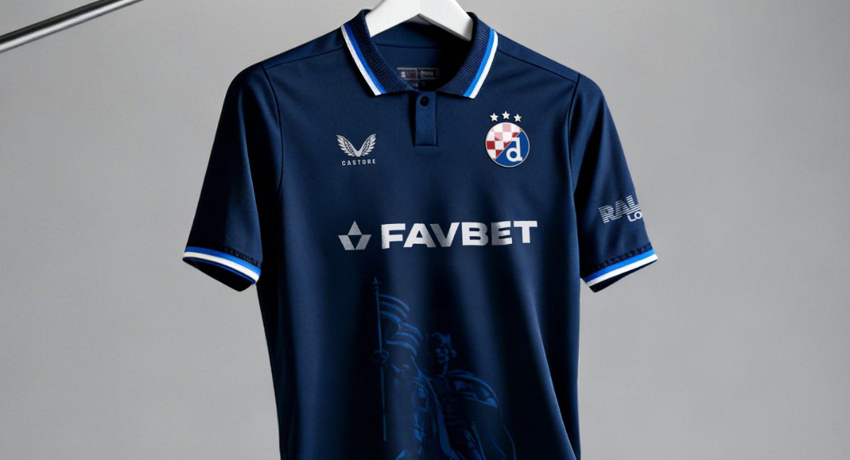
The winning fourth kit is called "History", and the design was created by Luka Lončarek. He found inspiration in the fusion of culture and identity of our city and country, united in the depiction of Zagreb's monument to King Tomislav.
When we launched the GNK Dinamo fourth kit selection project, we knew this wasn't an ordinary survey. It was a true design adventure - an invitation to all creatives from Croatia to design a kit that would bear the blue crest. We received 858 applications, and the expert jury selected 32 finalists based on criteria such as Dinamo's identity, originality, emotional impact and technical applicability.
After you selected the winner, the design was passed to Castore's team for detailed technical and regulatory review. Castore isn't just a brand that puts a logo on a kit - they are responsible for ensuring every garment complies with SuperSport HNL, UEFA and international intellectual property protection regulations, as well as ensuring the kit can be produced in all sizes and for all gender categories. The result of this review was a list of specific notes for the selected design. It's important to note that this wasn't about changing the concept, but about technical adjustments that are a prerequisite for the kit to even reach sale and the pitch.
-38ce8bd9-2a43-47db-8d9d-6179820247ae-l.jpg)
Below we present an overview of the refinement categories - so you can understand what's behind these changes and why they are necessary:
Foreign brand trademarks - one of the most common problems in sports equipment design is the unintentional use of visual elements that are protected as foreign trademarks. These elements cannot appear either as decorative elements or as accidental visual motifs on equipment from another manufacturer. This isn't a creative decision, but a legal obligation that applies in all markets where the kit would be sold.
Graphic motifs and competition regulations - visual motifs on professional footballers' kits cannot be an arbitrary choice - every element goes through the filter of SuperSport HNL and UEFA regulations. This particularly applies to depictions of architecture, religious symbols or real people. Specifically: depictions of cathedrals, churches or religious buildings may be rejected in European competitions if the governing body assesses them as religious symbols rather than neutral architectural motifs. Therefore, for any such depiction it's necessary to:
- Stylise it to a level of abstraction that retains recognisability but loses direct religious connotation;
- Ensure that graphics don't cover mandatory technical zones of the kit (player number, name, league logo);
- If necessary, create a special version of the kit for European competitions with reduced graphic content.
It's worth noting that the same rules don't always apply equally strictly on home ground - some graphics are acceptable for SuperSport HNL appearances but would be rejected for matches in UEFA competitions.
Print tonality and visibility on the pitch - UEFA and FIFA have technical standards that regulate the contrast of graphic elements on kits. The reason is practical: referees, TV cameramen and the VAR system must be able to unambiguously identify the colour of each player's kit at all times. If a graphic motif is printed in too dark a tone on a white or light background, the kit may appear to have a different colour in certain areas when filmed - which can be grounds for rejection during technical equipment inspection before a match. The solution Castore recommends is to lighten the print tonality - instead of full graphic printing, use nuanced tone-on-tone or watermark effects that are aesthetically impressive but don't create contrast that would be problematic according to regulations. This refinement is particularly important for kits that would be used in European matches, while for domestic appearances the original tonality is acceptable in some cases.
Adaptation for all sizes and gender categories - every design that GNK Dinamo places on the market must work equally well in all sizes - from the smallest children's kits to senior plus-size and in men's and women's cuts that have different proportions and ratios. This is particularly challenging for designs that use motifs extending across the entire surface of the kit body - such as depictions of buildings, cities or abstract patterns. On smaller cuts, graphics can be:
- too fine and unrecognisable;
- cut at seams in the wrong place;
- disproportionately distributed in relation to logos and sponsor inscriptions.
Castore requires that for every such design there exists a technical document on motif positioning that defines exact coordinates, sizes and scaling priorities for each size and kit category. Creating this document is part of the final proposal refinement process.
Copyright and intellectual property of graphics - this is perhaps the most sensitive point of the entire process. A GNK Dinamo kit isn't just sports equipment - it's a commercial product sold globally that must meet intellectual property protection standards in all distribution countries. Every graphic element on the kit must have clear and documented origin:
- If the designer used their own photograph or illustration - this must be confirmed;
- If graphics were created using AI tools - the terms of use of that tool for commercial purposes must be reviewed and it must be verified whether that tool's training set possibly contained protected content;
- If a third-party photograph was used - a licence or full right to use is required;
- In some cases, even building architecture can be copyright protected - especially for recent buildings, but protection for commercial reproduction may exist even for some older ones.
Castore and the club's legal team checked the origin of every visual element in the final proposals to exclude any legal risk before putting the kit on sale.
Every note from Castore's team had one goal - to ensure that the designer's vision reaches the end user in full glory, without legal, technical or regulatory obstacles. The refinements that were made didn't change the essence, story or identity of the winning design - they only adapted it to the reality of the professional sports industry.
After making the necessary changes, below we present the final appearance of the winning kit:
The kit has retained all the key design elements for which members chose it, and has been refined to meet the highest standards expected of it so that it can truly be a kit in which our players can compete, win and write some new, glorious pages of Dinamo's history.
Thank you and - long live Dinamo and mother Croatia!
-42f92049-6424-49f0-8a75-d0871718e9cd-l.jpg)
